✦ Karthi presents · Movie 01 ✦
Zuper.
The old brand wasn't ugly. It was undecided. A homepage refresh became the company's whole visual language, and then a system that runs without me in the room.
- Role
- Senior Manager, Visual Design. Led end to end, presented to the executive team as one vision.
- Scope
- Colour, character cast, typography, website, decks, email, social, live design system, AI brand tooling
- Market
- Field service businesses, US-led, global product
An AI-first field service platform whose brand looked different on every surface, and like every competitor on most of them.
Decide everything once: one orange, one gradient, three typefaces, a surface rule, and a cast of mini-human workers in place of stock photography.
A new visual language live across web, decks, email and social, a public design system, and brand rules that ship as a Claude skill for the whole company.
Undecided, not ugly.
Every asset had been making its own decisions about colour, type and imagery. A thousand small choices added up to a company that looked different everywhere it showed up, and too much like everyone else in its category.
Field service marketing has one stock hero: the smiling man in a polo shirt, holding a tablet, pointing at a roof. The brief I set myself: decide everything once, and retire the tablet guy.
Wearing orange vs. owning it.
Orange used to be an accent that showed up in the logo and left. Before I joined, the events team had gone all orange at a trade show, and people could spot Zuper from across the hall. The instinct was right; it just wasn’t a system yet. My job was to turn “we love orange” into one.
One orange. One gradient. Locked colour codes. And a firm no to every new variant, including my own. Repetition is what makes it recognisable: you know whose slide it is before you read a word.
Retiring the tablet guy.


Zuper isn't software you stare at. It works alongside crews, in their world. So instead of one stock human, I created a cast of mini-human field workers who climb the product and do real jobs inside the interface.
The craft was in restraint. Every time a character got bigger, the page got worse: if you notice the character before the message, it has gone rogue. They live at thumb size, quietly working: carrying gear, climbing ladders, on the tools.





Every AI agent gets a face.
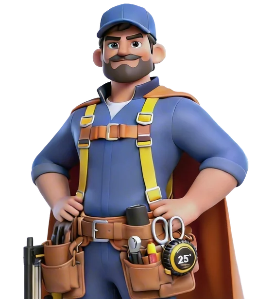
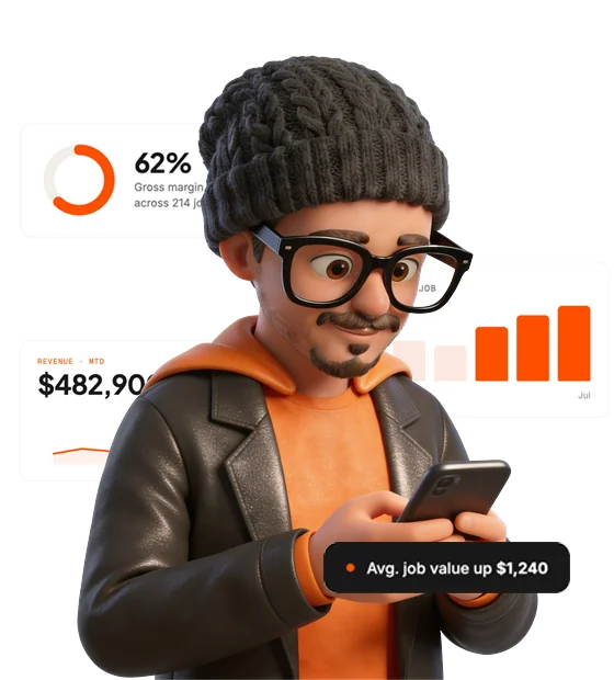
Zuper sells a team of AI agents, and a feature list doesn’t make anyone feel looked after. So each agent got a caped mascot: a front-office agent with a headset, a field technician with a tool belt, a sales coach, a review analyser with a magnifying glass. One cape, one orange, one lighting setup, so seven characters read as one family, not seven illustrations.
The mini-humans do the work in the product; the agents are the ones customers meet. Two casts, one rulebook.





Boring decisions win.
Headlines, body and technical labels. None does another's job, so a whole class of layout decisions disappeared.
Every section type has a surface, and dark is reserved for exactly one product. The dark screen itself now means something.
A live design language system for colour, type, spacing, components, mini-humans, agent avatars and deck rules, plus a self-serve asset library.
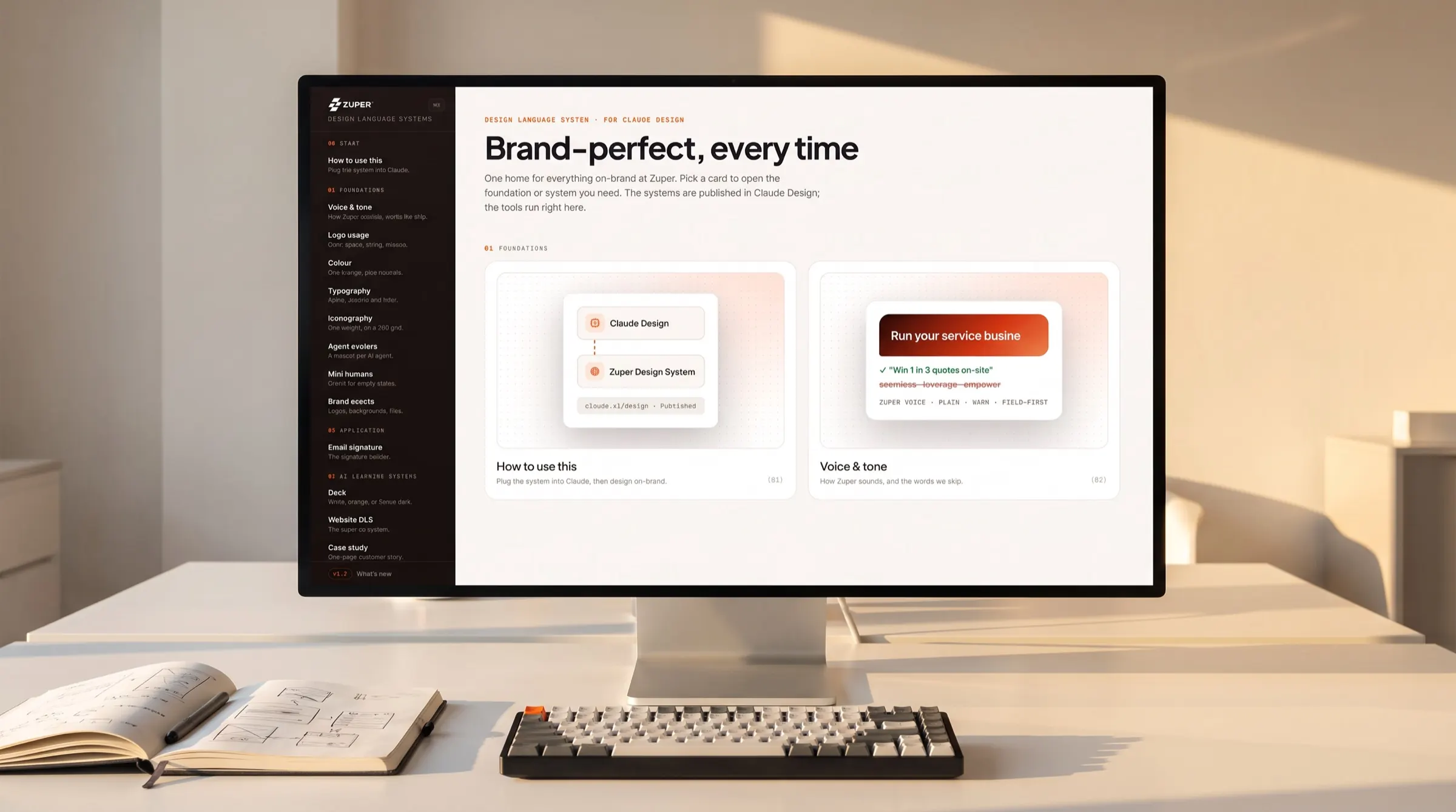
Everything, on one page.
The homepage refresh is where all of this started, and it's where every decision lands at once: the orange, the cast, the agents and the type.

Making taste installable.
Teams shouldn't have to wait for design. The whole system ships as a Claude skill: anyone in marketing or sales installs it, asks for a deck, email or landing page, and gets it on-brand, with the right orange, gradient, fonts and voice.
The rules I used to enforce over people's shoulders now enforce themselves, and design time goes to new work instead of guarding old work.
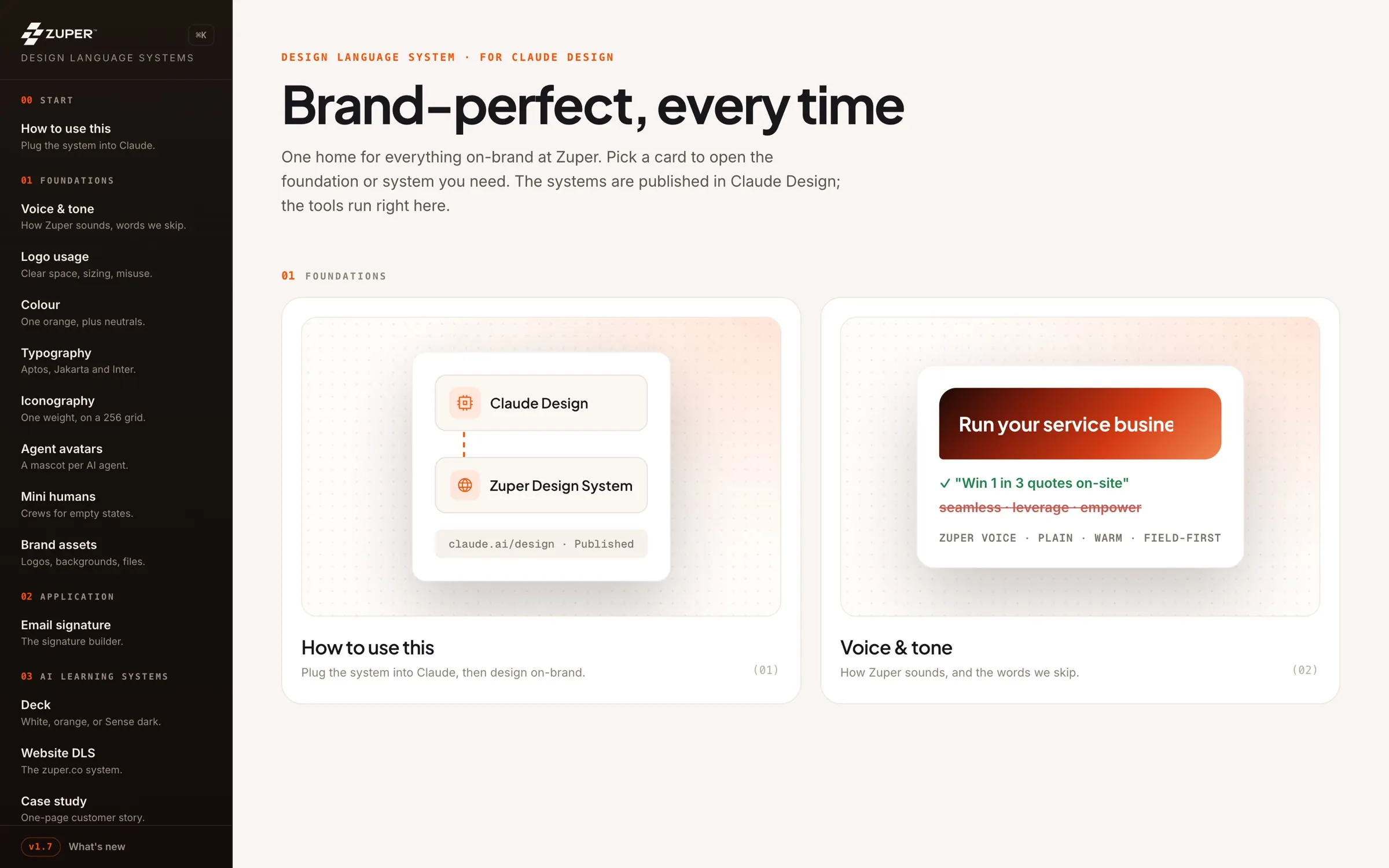
Not magic.
Decided.