✦ Karthi presents · Classic 03 ✦
Algarve
A destination brand for the Algarve, built from what people travel there for: rock, sea and sand.
- Role
- Brand identity designer
- Industry
- Tourism, Portugal
- Scope
- Symbols, wordmark, palette, type, applications
- Year
- 2019
The Algarve tourism bureau promotes the region to travellers, the travel trade and the media. It needed one identity that could speak to all of them.
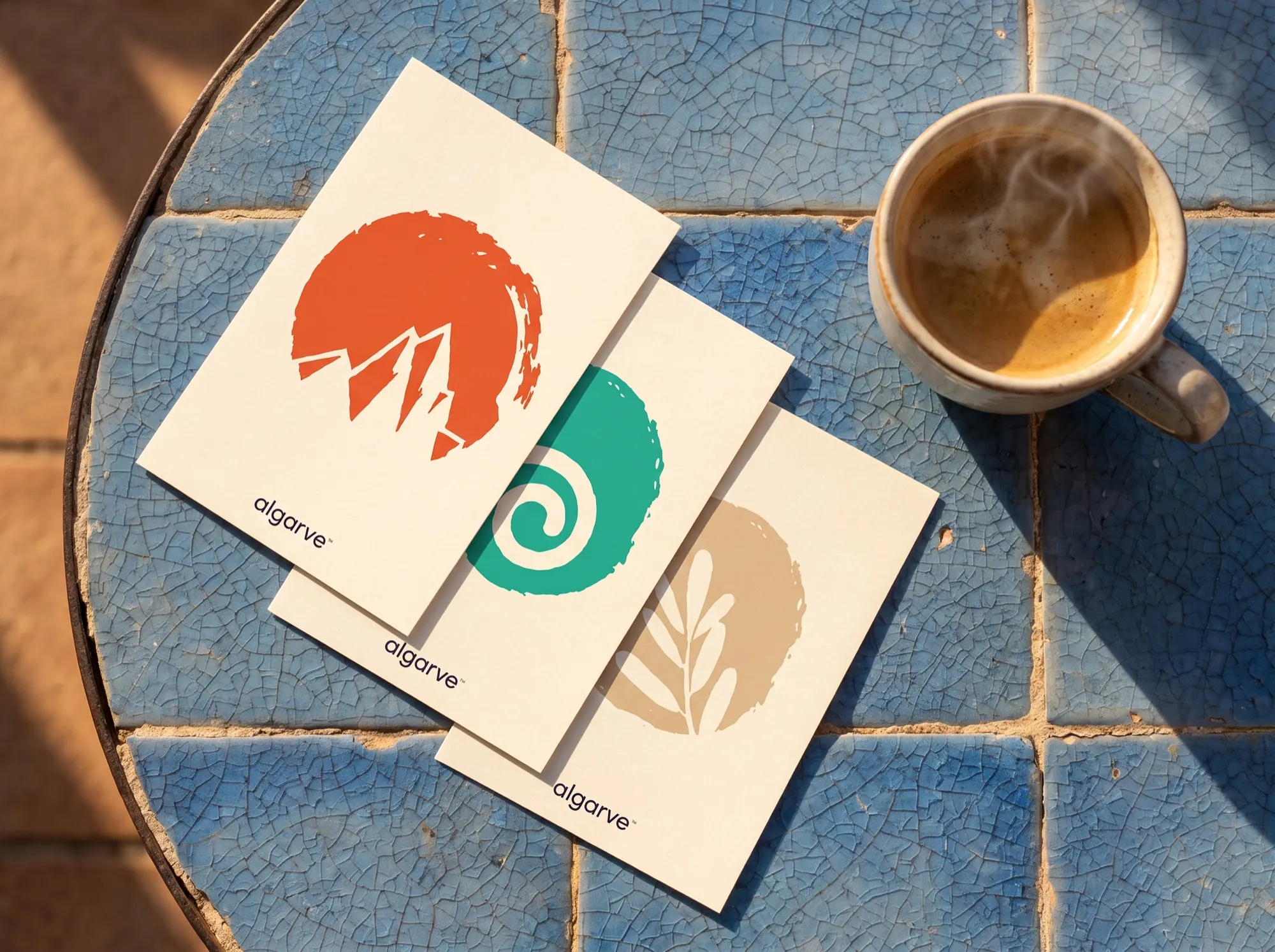
Three hand-cut symbols for rock, sea and sand, each coloured from the coastline itself, with Code Pro for a clean, modern voice.
Symbols, wordmark, palette and type, with applications from posters to merchandise.
Rock. Sea. Sand.
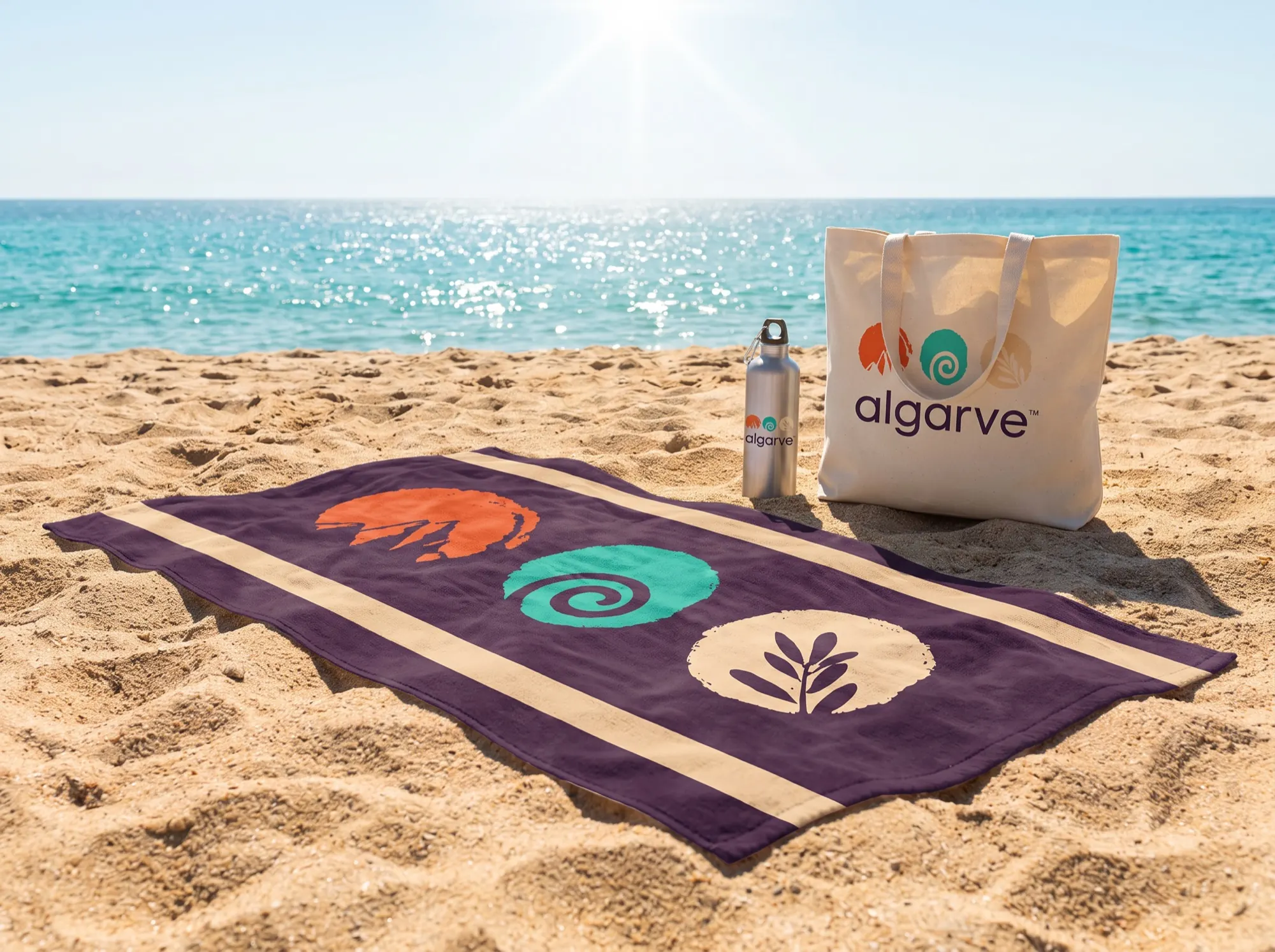
Golden cliffs, turquoise water and warm dunes are what people remember about the Algarve. Each became a hand-cut symbol, slightly rough at the edges like the coast itself.
Side by side, the three symbols read as the whole region in one glance.

Pulled from the coast.
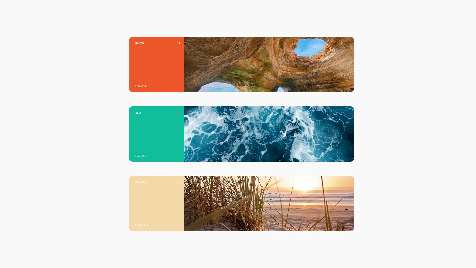
Rock orange, sea teal and dune sand, grounded by a deep night plum.
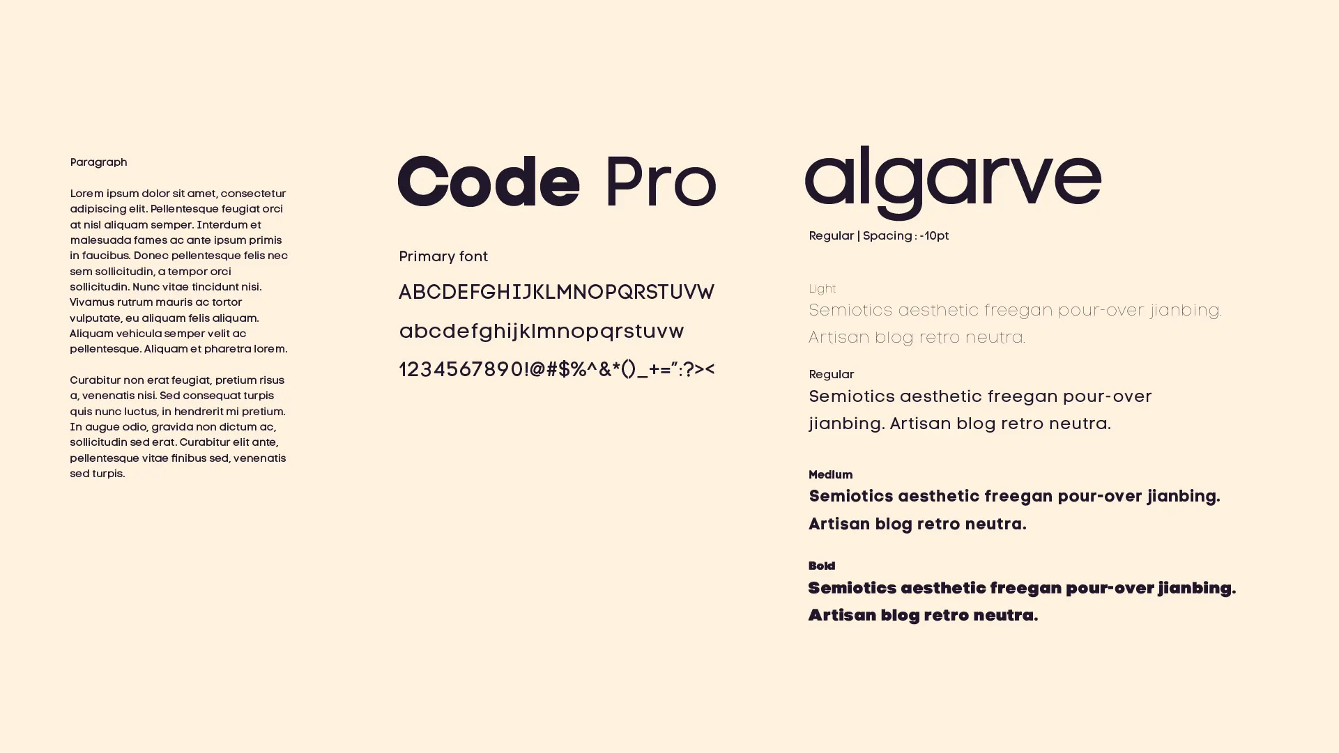
Code Pro.
A geometric sans with a friendly, modern voice for a region that is both old and new.
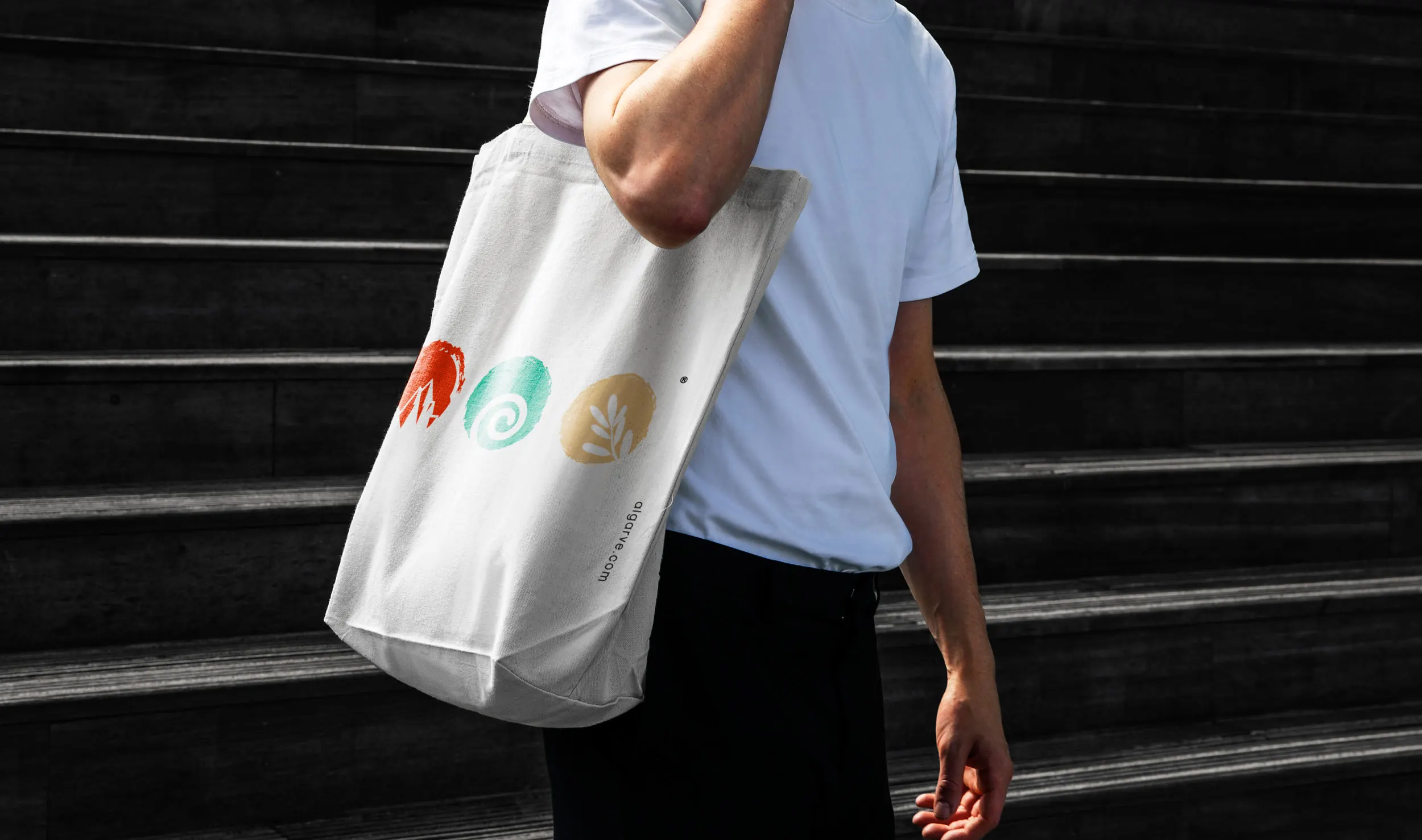
On the coast, in your hands.
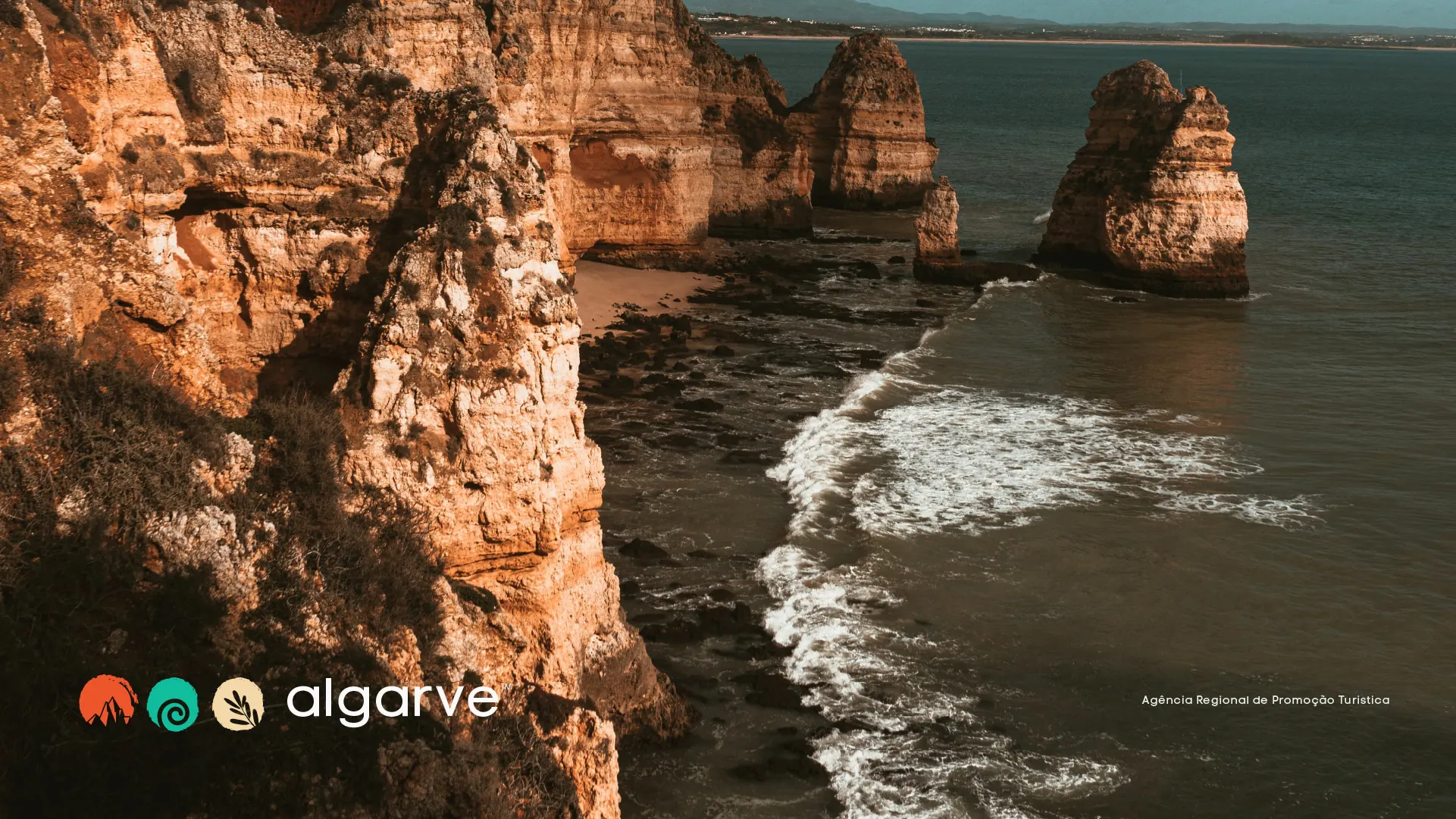
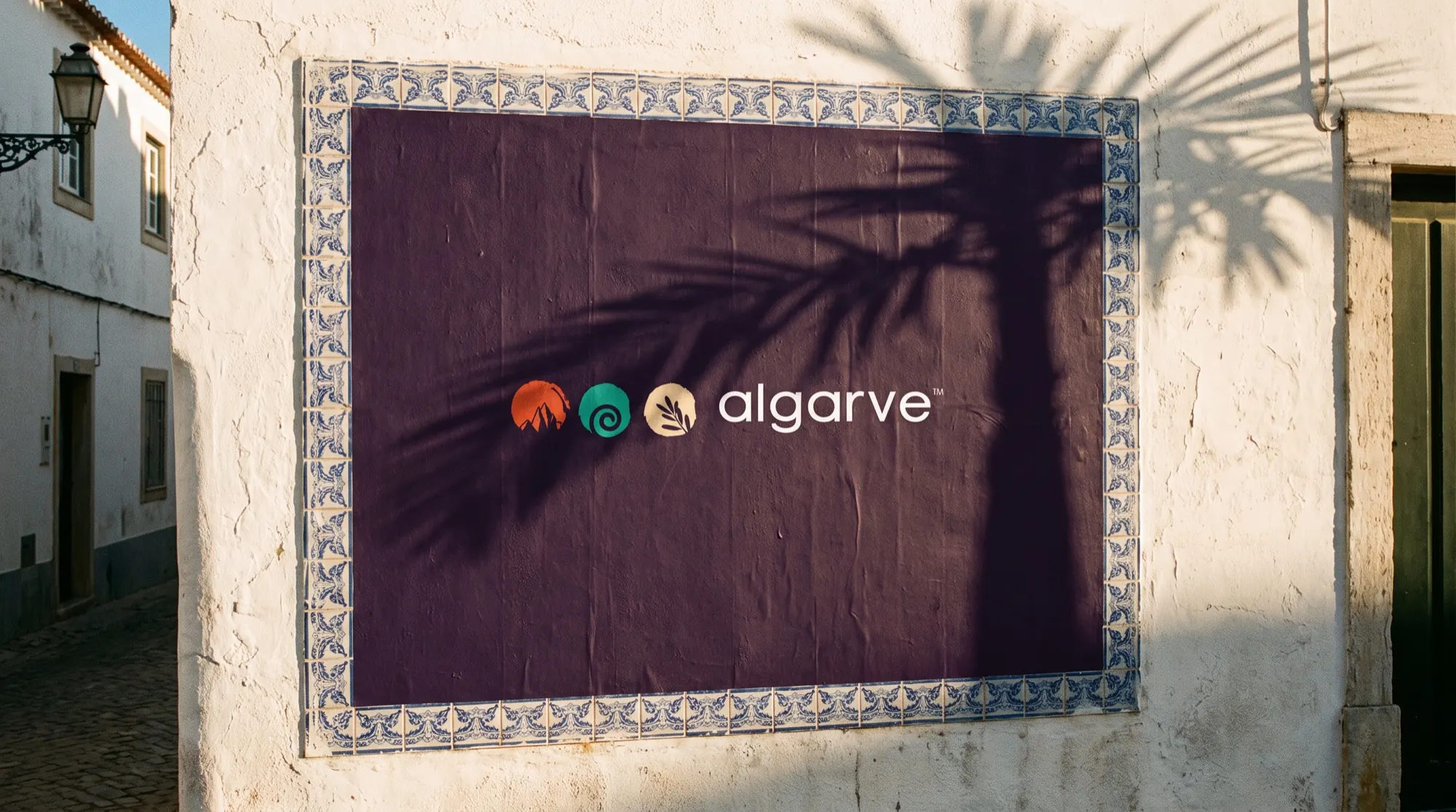
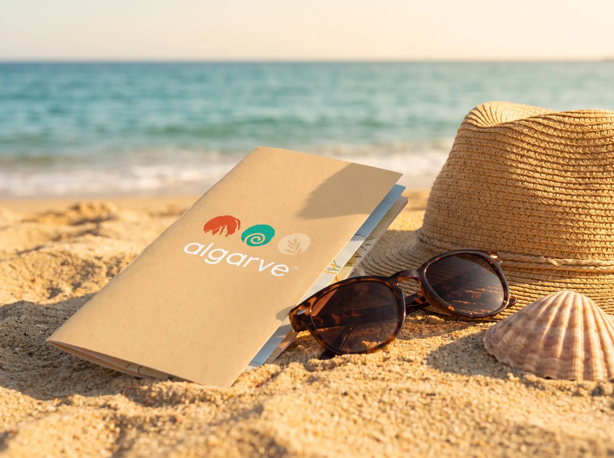
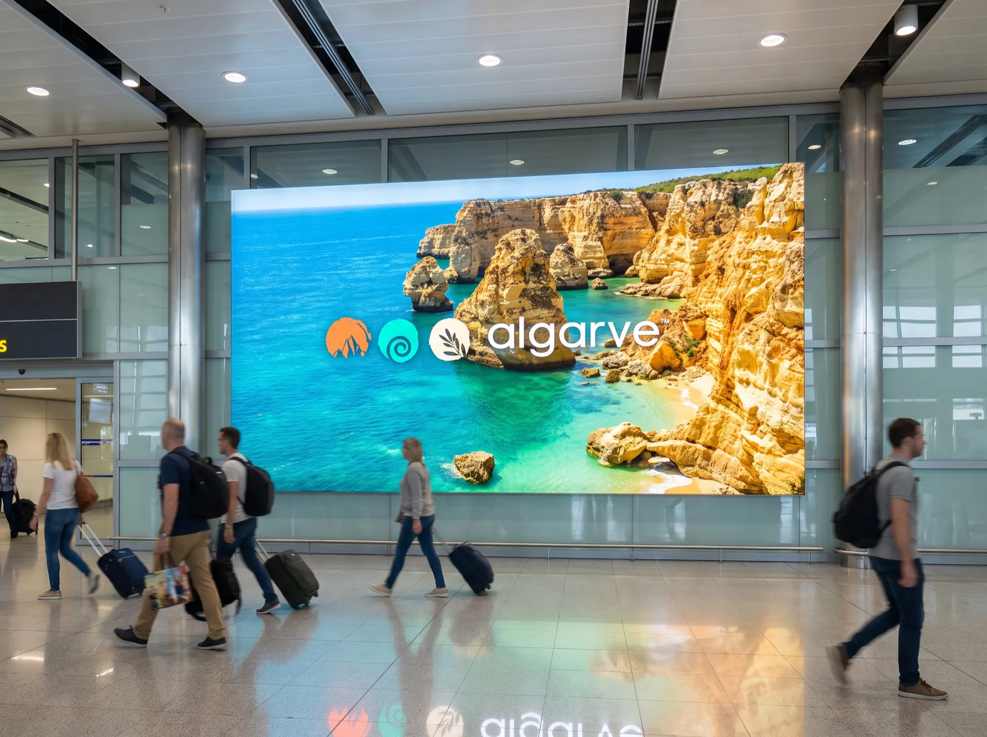
From cliff-top imagery to merchandise, the symbols travel well.
Algarve.
2019.